Mark in Motion III
At last, the company has a logo, and I love it. After the feedback from last time, the designer and I have completely aligned our vision for the logo, offering me some exceedingly eye-catching marks for the second round of feedback:

Caption: Designs and sketches for client meeting 2 with my notes in purple choosing the combination that I liked best.
In an email, the designer said that: “A’s, B’s and ‘onae’ & ‘rtis’ can all be used with a different ‘A’ / ‘B’ / ‘onae’ & ‘rtis’ then the ones they are used with right now. Please choose the ones you like the most.”
After taking some snippets and rearranging in Adobe Illustrator, I replied to the email with some feedback:
2nd Client Meeting Feedback – Bonae Artis
Strengths:
These logos are absolutely brilliant! The style of the font shown through the curl of the letters expresses the artistic quality that leans towards a whimsical representation, yet the serif font of the rest of the name on the right of the A and the B gives off a more professional feeling. This perfectly captures what my company stands for.
Given these choices, I have gone with the attached combination.
Improvements:
As we move forward to client meeting 3, I would like this logo to feel more polished. Its current composition is perfect, and it would be great if we could refine the details around the hand drawn A and B. Please make sure that the A&B are relatively clean vector shapes for the final design, and it would be great if some of the defects found on the ends and edges of especially the A could be polished. Other than that, this is looking great!
Deliverables:
As we had discussed previously, please try your best to meet the 3rd client meeting on the 27th of May. I would like the following items:
An AI document
An PNG with 1080x1080 resolution
An PNG with 500x500 resolution
An SVG
A written description of the logo
Once I have received the third client meeting, we could arrange sometime to sign a contract, which I will have prepared thus.
Conclusion:
It takes a huge amount of time and effort to get it right, and this logo certainly shows a plethora of effort and commitment. Thank you very much for this entire project, and I look forward to seeing the final design.
Sincerely,
Bonae Artis
Today, the designer and I met up in person for the first time, they transferred the final documents to me, we both reviewed the contract, and signed on the dotted line.
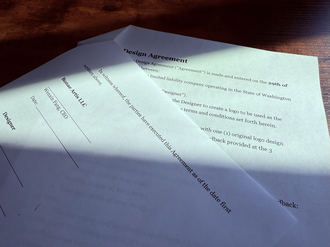
Caption: Our contract right before signing.
The contract included clauses about the transfer of copyright ownership, which means that Bonae Artis LLC now officially owns the entirety of the copyright associated with the logo. This concludes this miniseries and the journey for the Mark. From rough sketches and miscommunications to a mark that finally feels like Bonae Artis itself.