The Expo Rush
The logo came just as the annual STEM Expo rolled up around the corner. Juniors and seniors here at Tesla STEM prep for entire school years to present at this event, and I, the only freshman to be offered a table, had 4 days to set up the website, design and make a trifold, prepare a pitch, create a display, and finally give some thought to marketing… Sounds like it’s time for The Expo Rush!

Caption: Invitation and name badge for the STEM Expo.
It was at this point that I wanted to have something I could hand out to the visitors, and thus, I added more work to my plate by designing a business card that would capture the essence of Bonae Artis. This, along with the poster, took around 18 hours of work, but was by far the biggest push so far on my way to company legitimacy.
It’s worth noting here that, in my view and that of many others, starting a company means nothing if it exists in a record at the Secretary of State, and legitimacy lies in notability, value, and the products your company actually makes. The first aspect of this, notability, is where my trifold and soon-to-be website come along.

Caption: Creating the trifold in Adobe Illustrator.
What the Expo really gives me is a chance to come up with some marketing lines—how can I describe the protractor in a few words on a website? What about on a poster? On a LinkedIn page? On a small piece of 3.5in by 2 in paper? For now, the website will only serve as a landing page for visitors coming from the business cards, and it is essentially just all the information on the trifold restructured for the web.
Next, the business card became my primary focus. In such a small area, the card has to stand out, project the brand image, provide actual information, and create a lasting impression in the viewer. By keeping the “white on black” aesthetic and Serif font the same across my website, trifold, and card, I had effectively crafted the brand image of Bonae Artis.
Even with all of this, the display still looked quite empty. Filling in the rest of the space, I picked up a piece of black table cloth and heat pressed the logo onto it for an extra touch of professionalism. Rounding out the trifold, I designed little holders to display the major iterations the protractor went through. As is the goal of this development log, I want to share not just the end product, but the painful stumbles and windy detours it will take me to eventually get to the final product. Soon, we'll get there soon.
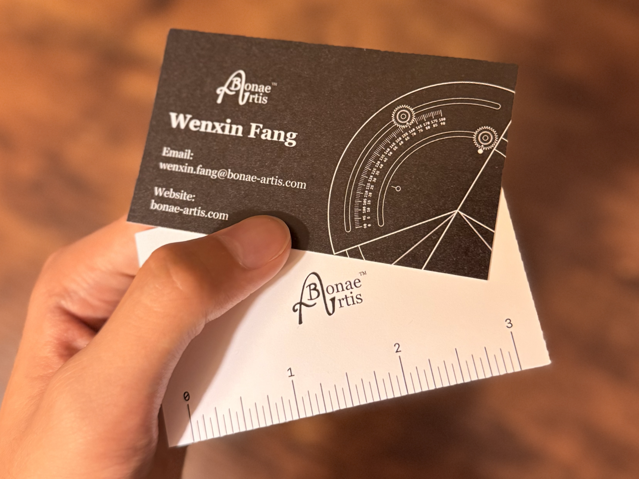
Caption: My business cards projecting the brand image.
The Expo came and went, and it all went surprisingly well. This past month has been focused solely on branding and marketing, and with the Expo having put a nice conclusion to that (at least in the short term), I think I’m finally ready to take that leap of faith and contact a manufacturer…

Caption: The final setup at the Expo complete with flowers, a card stand, displays of previous iterations, and a custom printed tablecloth.