Mark in Motion II
It is time! The designer has gotten back to me with the first version of the logo, and it doesn’t look quite how I expected it to…
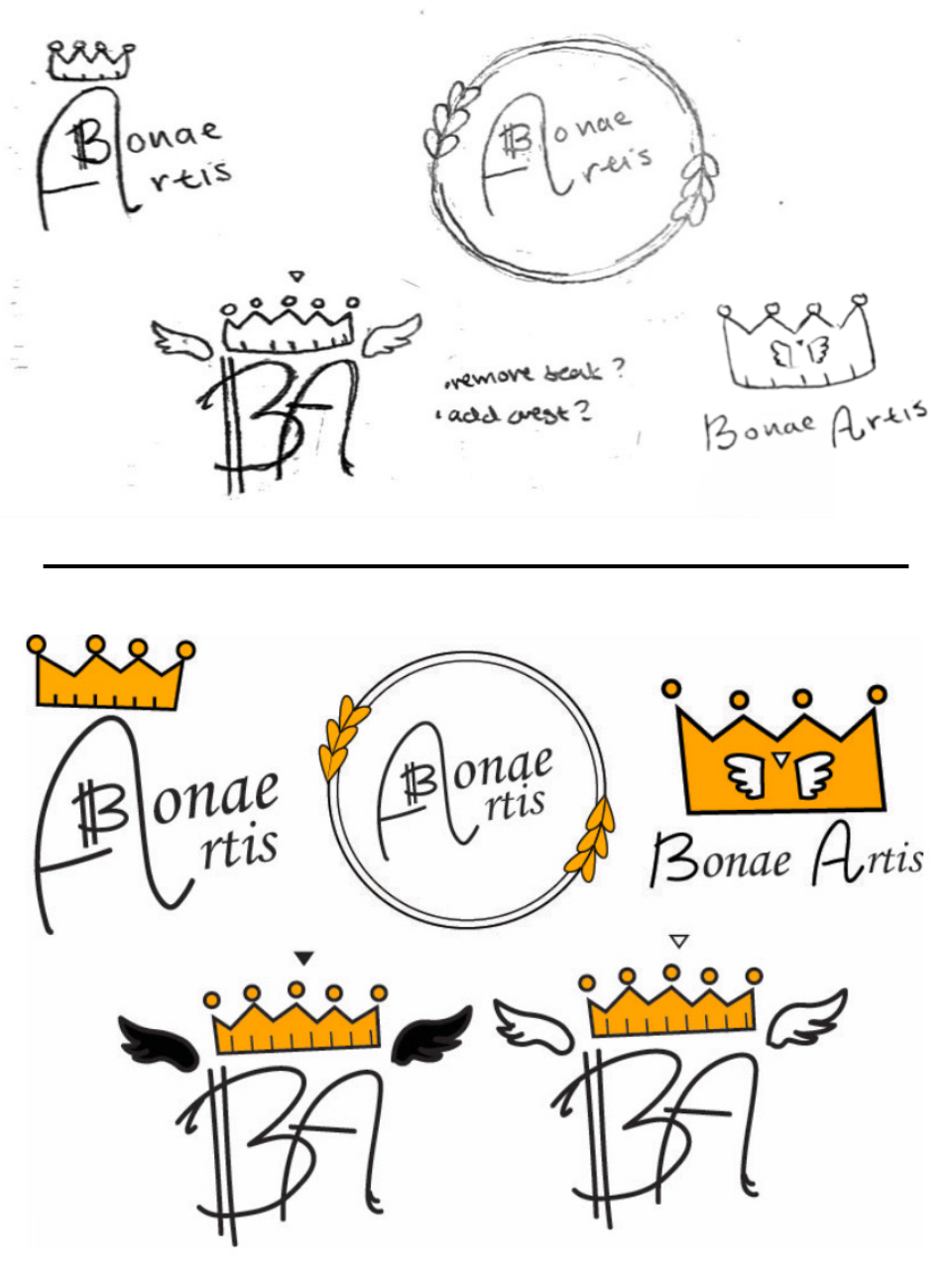
Caption: Designs and sketches for client meeting 1.
I soon realized that the issue lies in my inadequate description of what I wanted. The best designers in the world cannot read your mind; the only thing they have going off of is your design brief. I had imagined a black and white logo with pure typographical decorations, maybe including some handwritten text.
None of that was in my design brief.
I had previously described: “I want specific images and icons that I would like to see incorporated into the logo such as rulers, lines with serif text and motto, crown, bird, crest, etc.” The designer had perfectly reproduced what I had described; it’s just that what I have described was not what I wanted. In an attempt at clear communication, I wrote the following in my feedback letter:
1st Client Meeting Feedback – Bonae Artis
Strengths:
I think the most appealing part about that design is amazing concept of the “B” inside of the “A”, it creates a very interesting composition. This crucial design element outshines any of the smaller details in the design, and looks amazing.
Weaknesses:
I like the fact that the “A” and the “B” are customized typography. I would be nice to see the rest of the word “Bonae Artis” done in the same way. I don’t particularly enjoy how the double line in the “B” looks, so it would be great to see some variations on it. As far as the crown on top goes, I don’t think it works very well at a smaller scale.
Possible improvements:
Variations on how the “A” and “B” looks, I would prefer some more stylized and original typography.
In the same vein, I encourage you to try some variable width stroke on the lines to create more dynamic shapes.
I would like to go forward now with a purely typographical logo, a black and white word mark without the extra additions I previously suggested, and my apologies for the changes there.
Next steps:
I would like to see a set of 6 variations on the logo above, with variable line width and varying custom typography for each letter. Try looking at some luxury brand logos as references. Keep the great style of serif type combined with handwritten type, it fits my target audience exceedingly well.
Closure:
Here, I would like to take a moment to appreciate your hard work and beautiful design, these are impressive, and you have far exceeded my expectations. I would like to make sure you know that despite how the commentary above might come across as harsh.
Looking at next week, please do your best to complete the next stage before the 21st of May, acting as our 2nd client meeting. After that, if you could take a week to polish up the design, I am sure we can work out a contract by the 27th of May.
Again, thank you for bringing these fantastic designs for my company and many thanks to our wonderful Ms.—— for facilitating all of this and for helping me so much with this project.
Sincerely,
Bonae Artis
This highlighted an element of engineering design I hadn’t really considered before: just how crucial documentation and communication are. They make up a huge percentage of an engineer’s job, yet they’re also one of the skills I lack most. I have gathered some tips my mentors has given me about this issue below:
Show not tell, include images, sketches, and diagrams
Define terms carefully, don’t assume acronyms are shared knowledge
Proofread, or better yet, hand it to someone else and see if they can understand it
Don’t make assumptions, the other person has not worked on your project for several years like you have
In my case, I never actually explained that I wanted a black-and-white lettermark with custom typography. Part of that was because I didn’t know exactly what I wanted yet. But as I looked through these logos, the detail in the center of the crown jumped out at me, and suddenly I had a clear idea of what I wanted to become the mark of Bonae Artis.